Manioca | Branding & Packaging
Eat well and do good.
Branding
brand strategy
brand design
packaging design
MOTION
The challenge
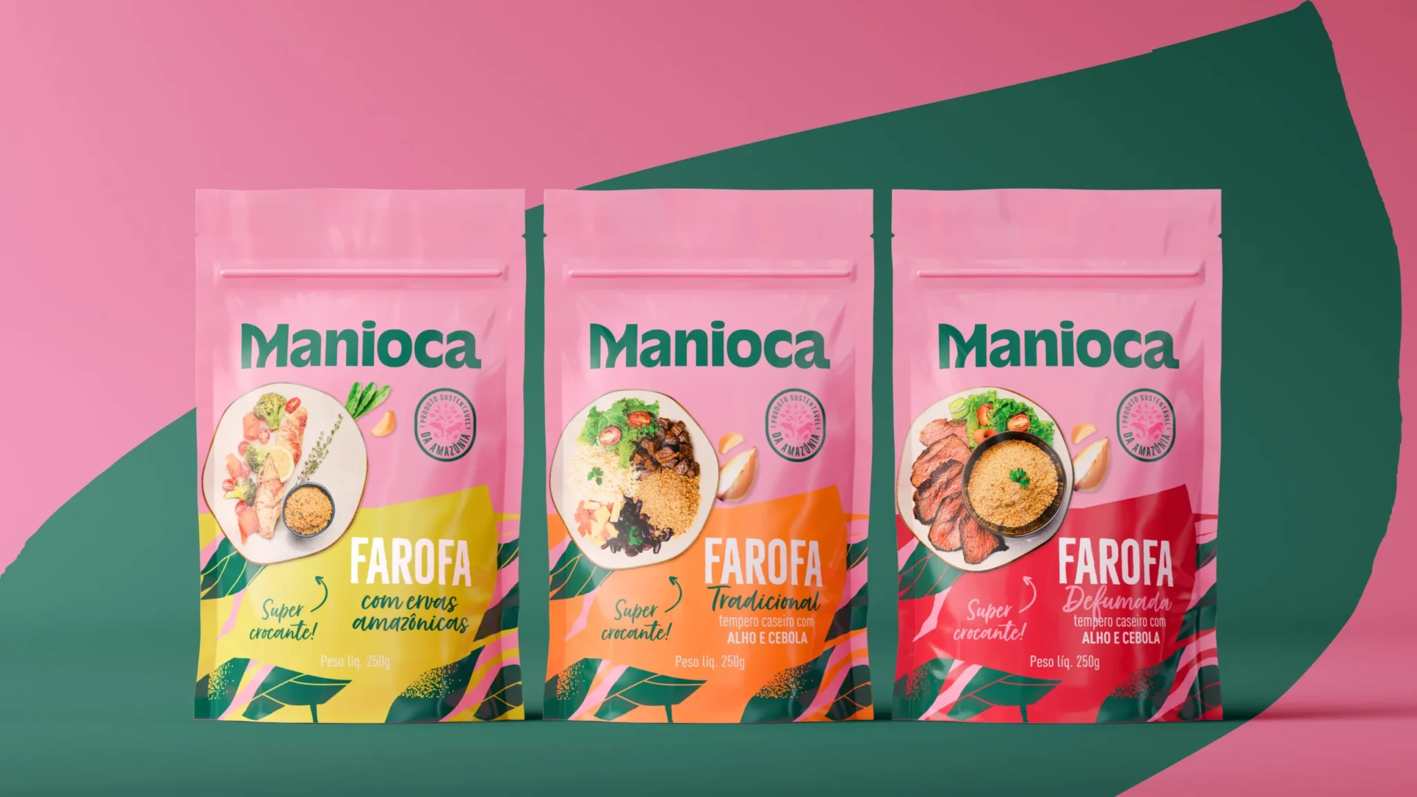
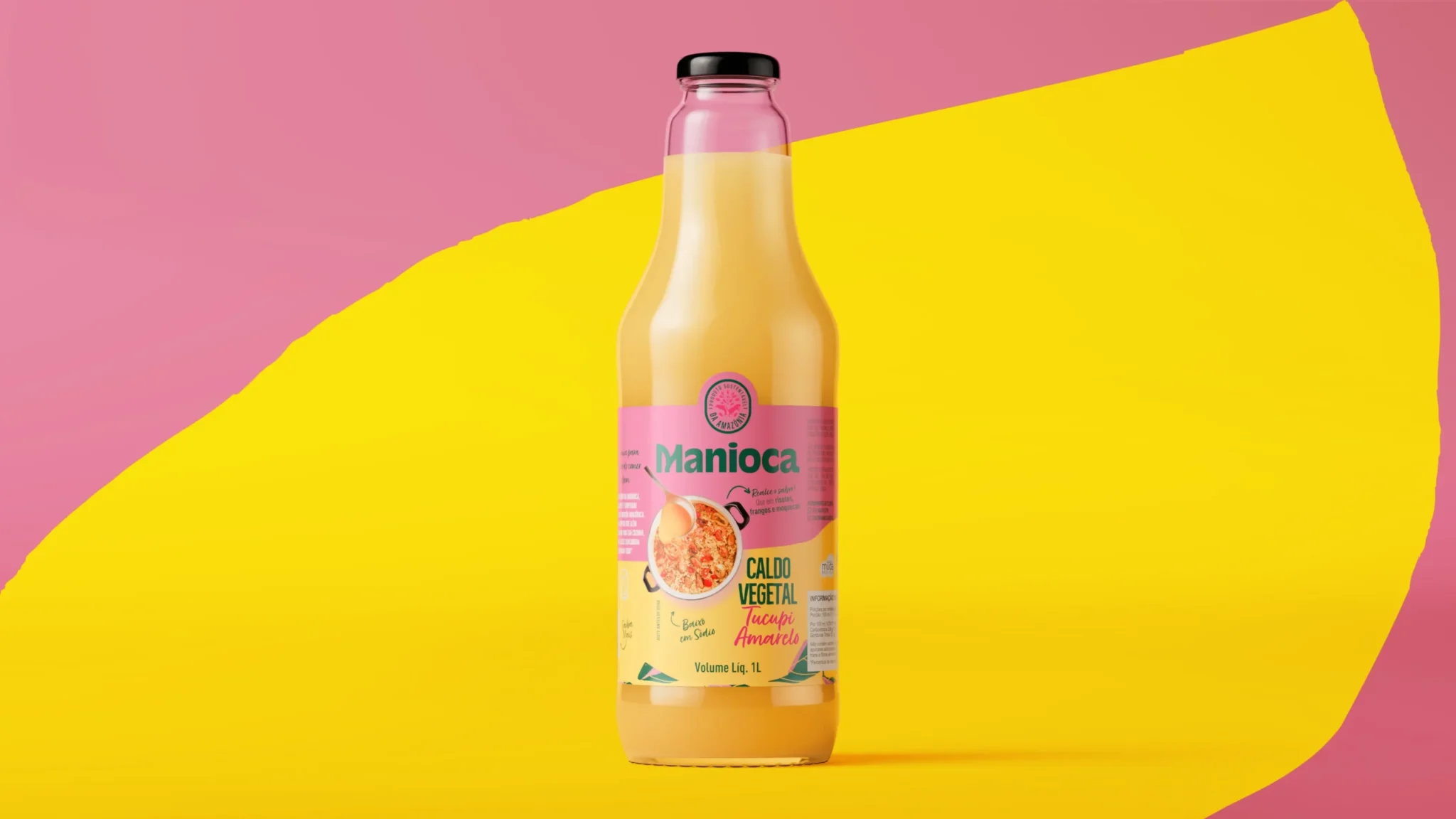
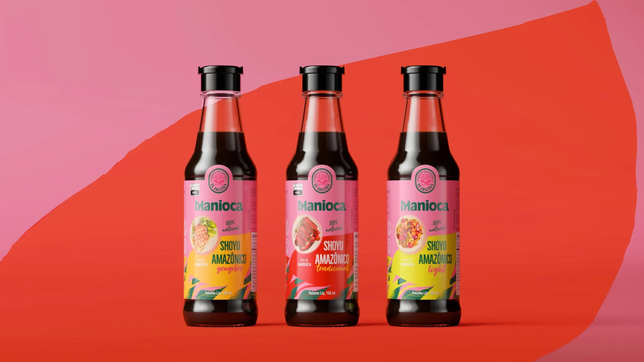
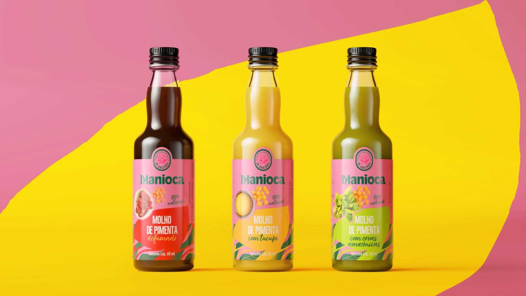
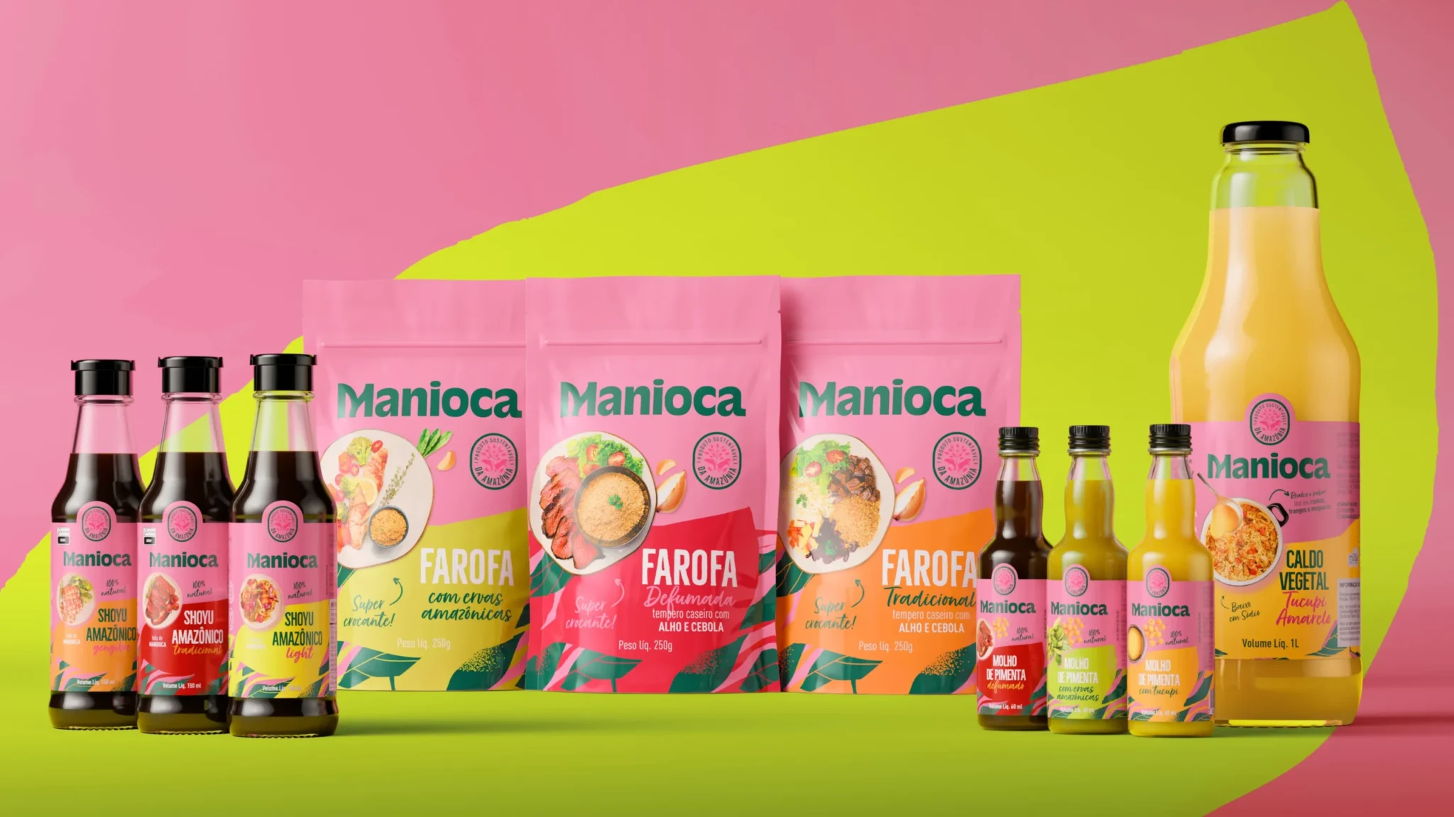
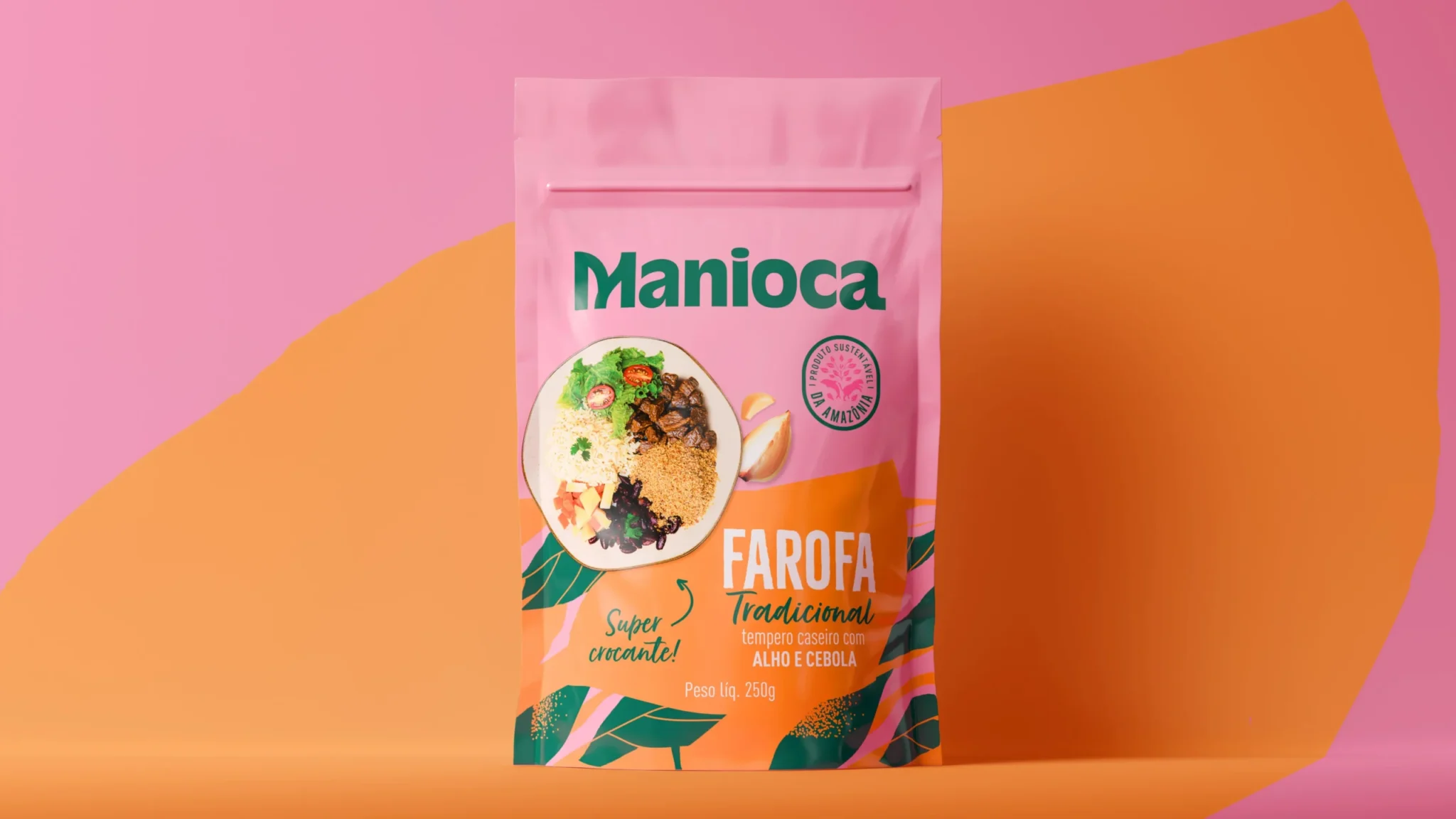
With the goal of bringing the unique flavors of the Amazon to the world, Manioca needed a new visual identity. The previous brand didn’t express, with strength and sensoriality, everything that makes its products special: authenticity, biodiversity, and the natural connection with the forest.
The solution
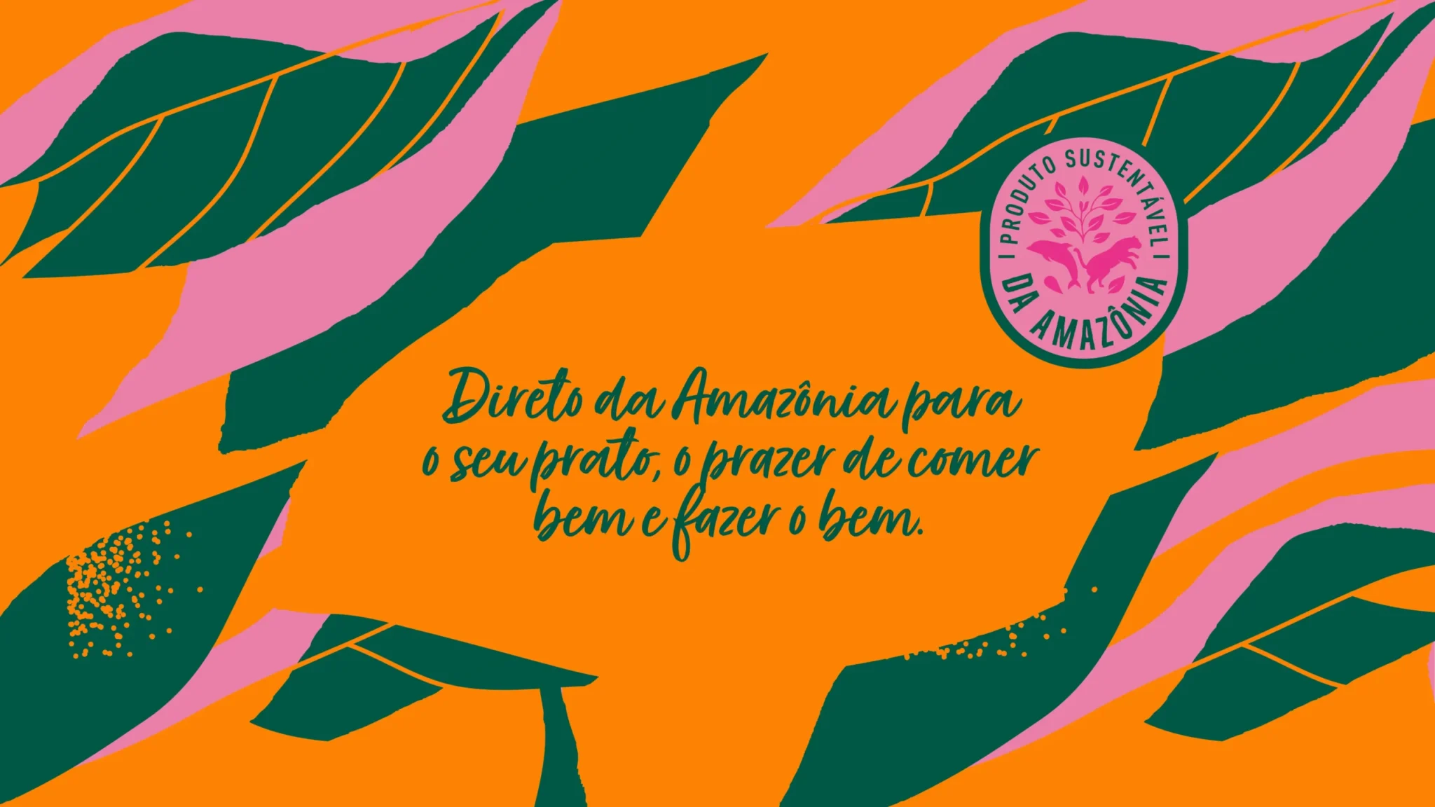
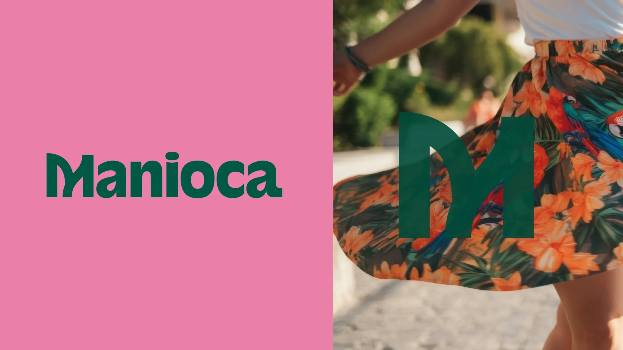
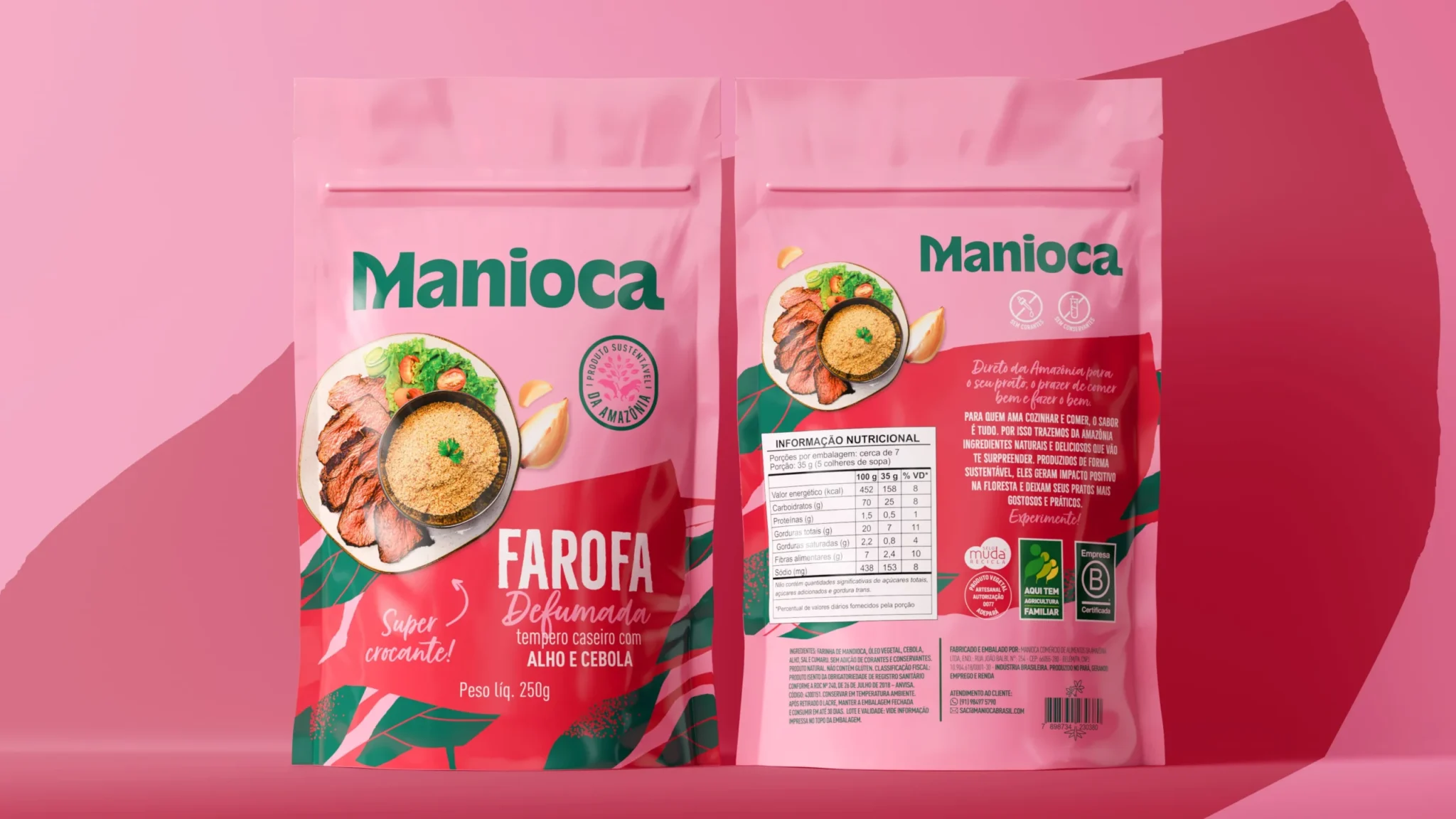
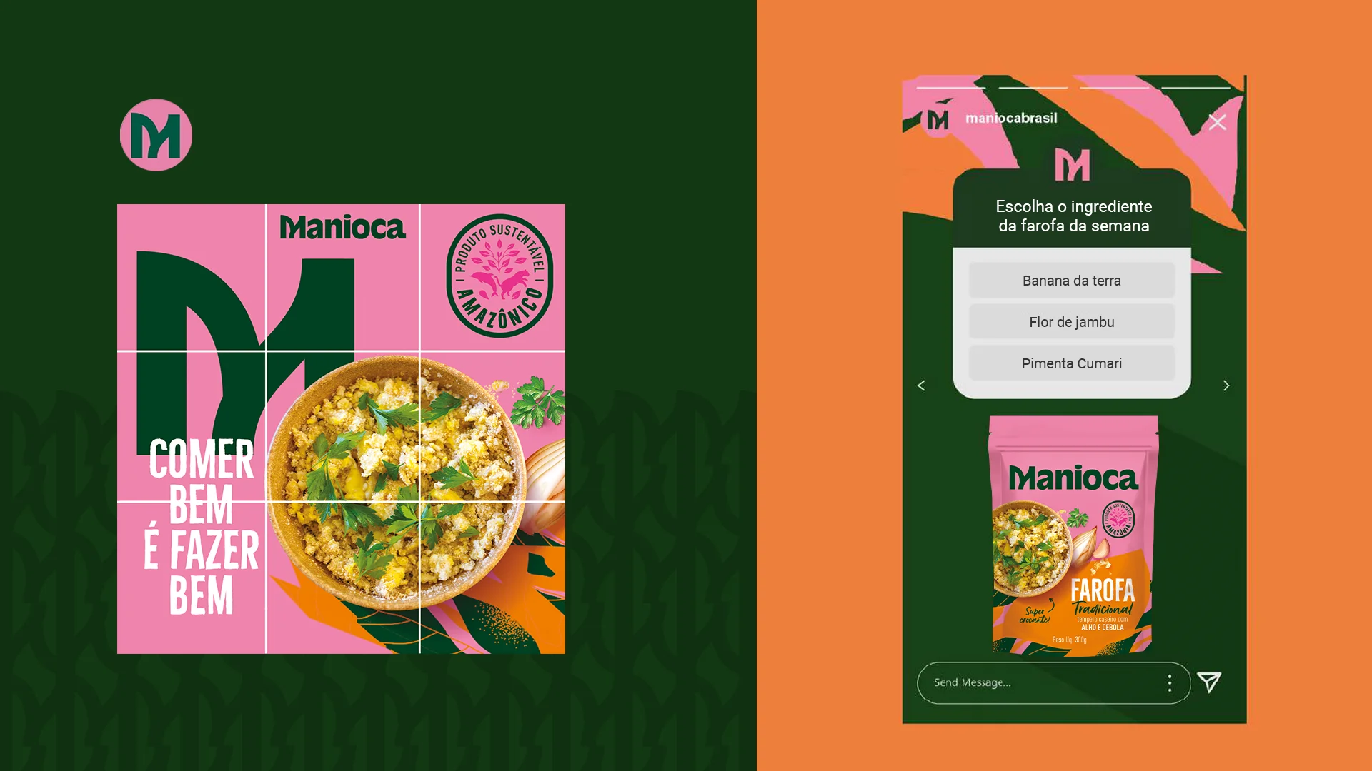
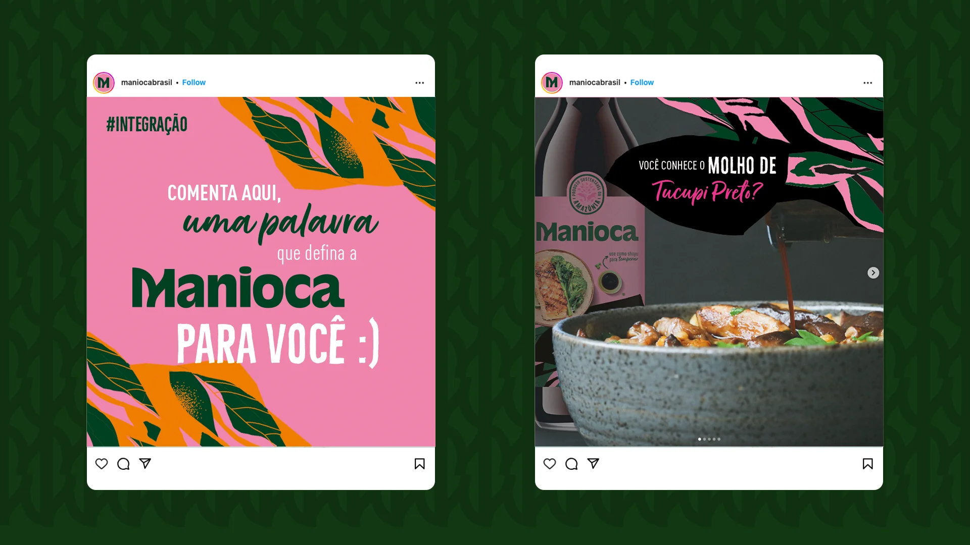
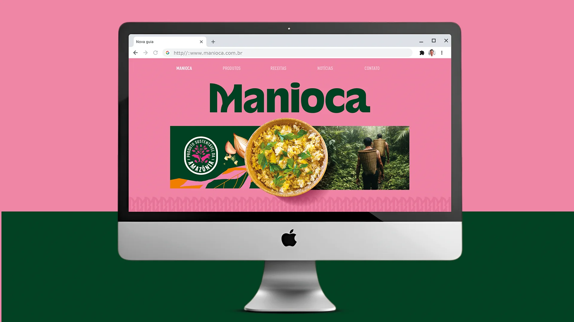
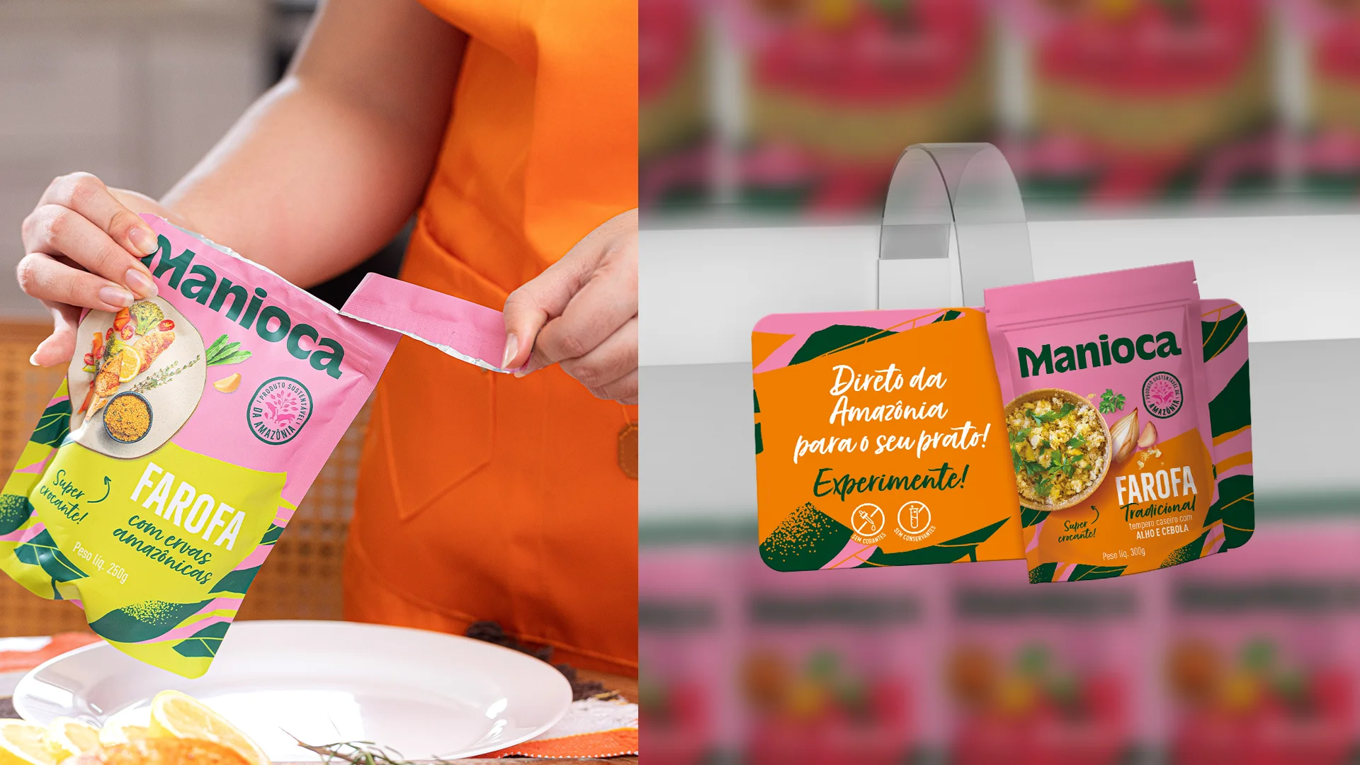
Based on an immersion in Amazonian culture, we created an identity that conveys the essence of Manioca through color, rhythm, and symbolism. The pink of the river dolphin, the green of the forest, the leaf graphics, and the “M” inspired by rivers and carimbó brazilian rhythm form a unique visual system, applied throughout the brand’s language, including the packaging, which has gained even more expression. We also developed a proprietary seal, reinforcing our commitment to sustainability and local communities.

The result
A vibrant, sensorial, and original identity that conveys the Amazon with respect, beauty, and power, elevating Manioca to a new level of expression.