MARONI
Charging the world with courage for simple and sustainable initiatives.
Branding
brand strategy
BRAND IDENTITY

The challenge
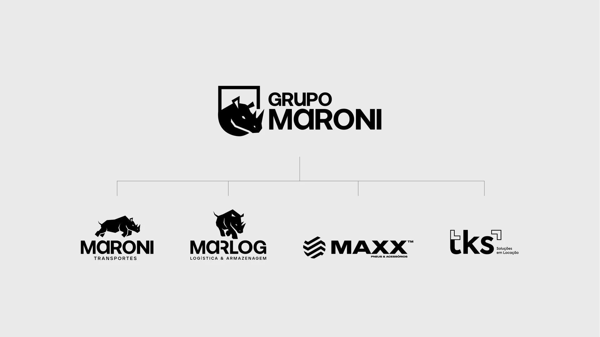
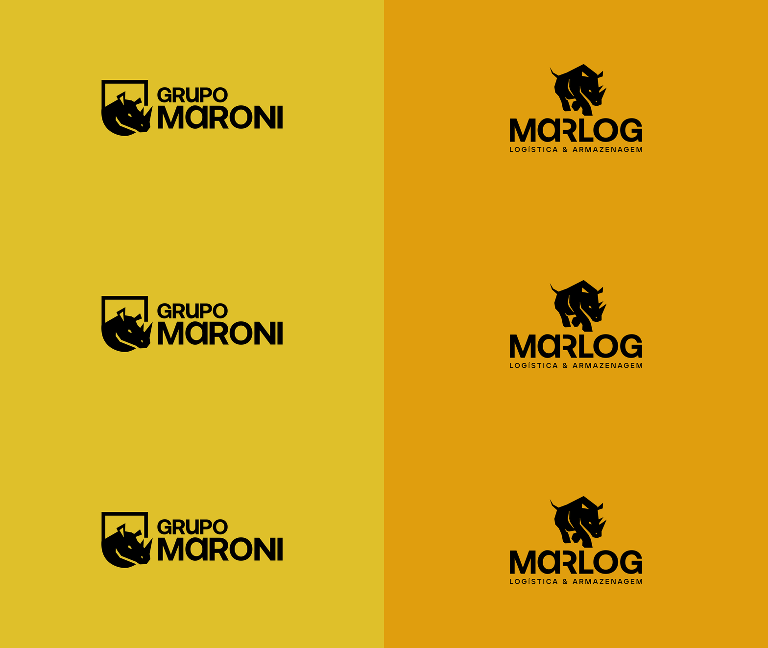
With business expansion, the family-owned company Maroni, which already had operations in transportation (Maroni) and logistics (Marlog), needed to reorganize its identity and positioning to integrate new ventures: an equipment rental company and a tire dealership. The challenge was to align vision, brands, and communication, creating unity without losing the individual strength of each business.
The solution
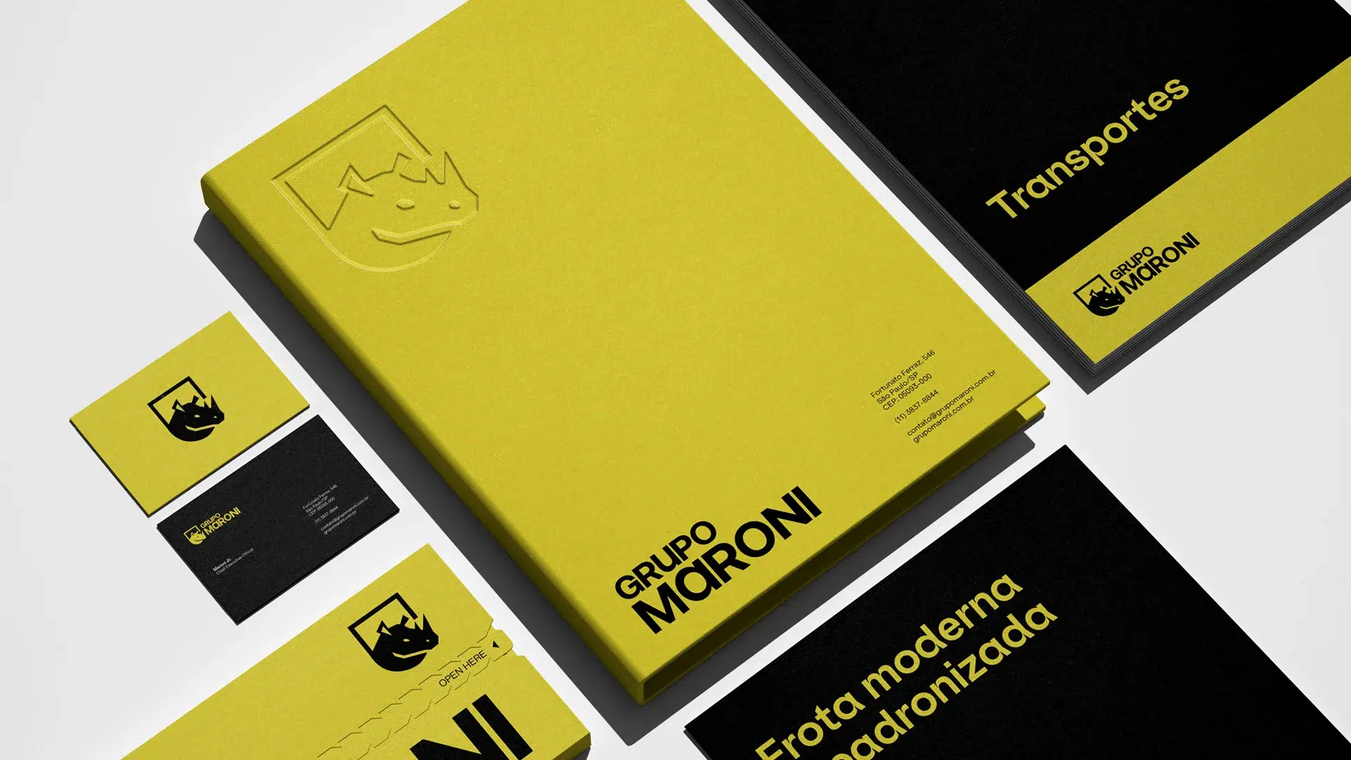
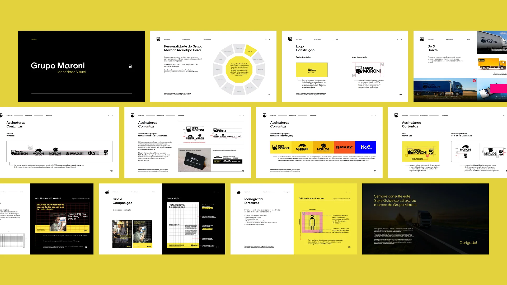
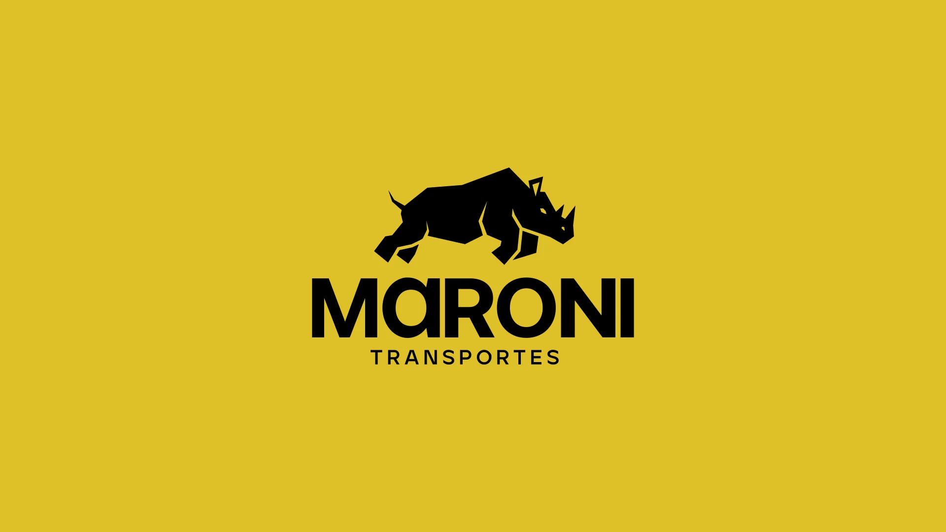
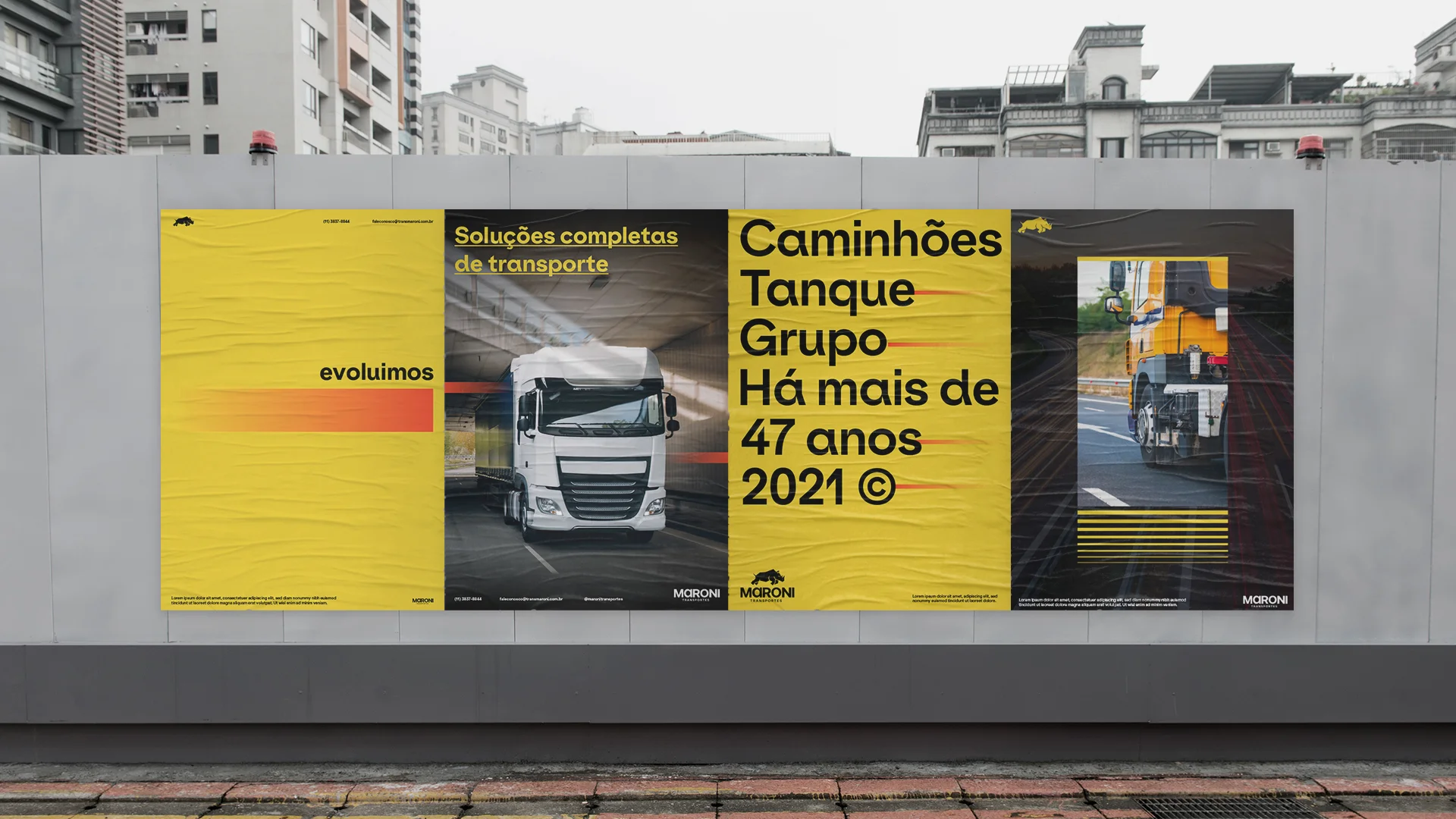
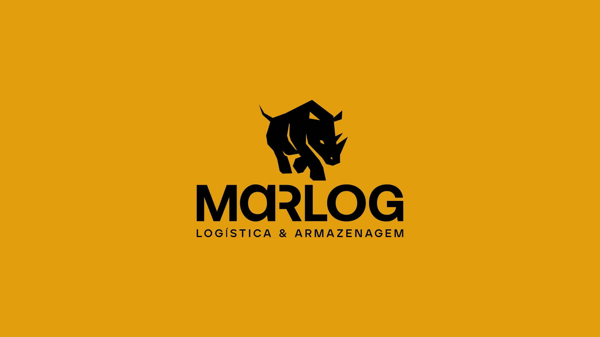
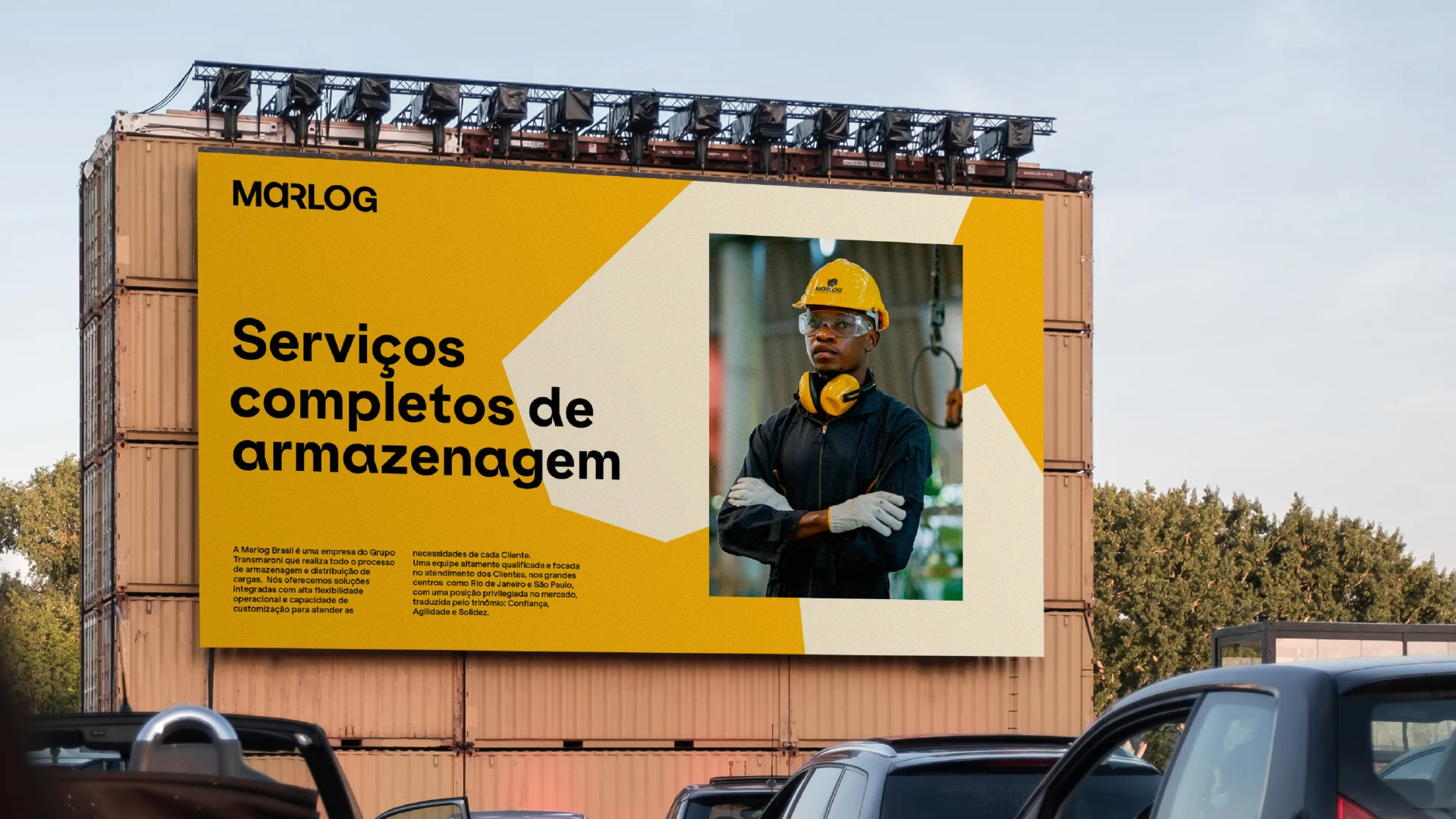
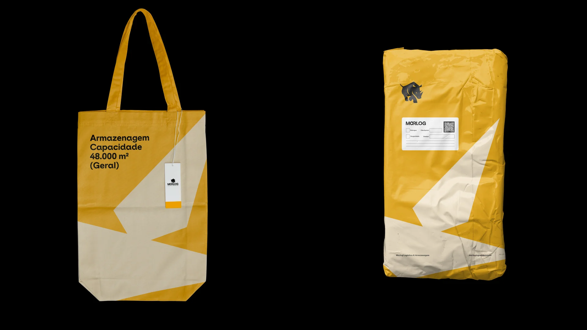
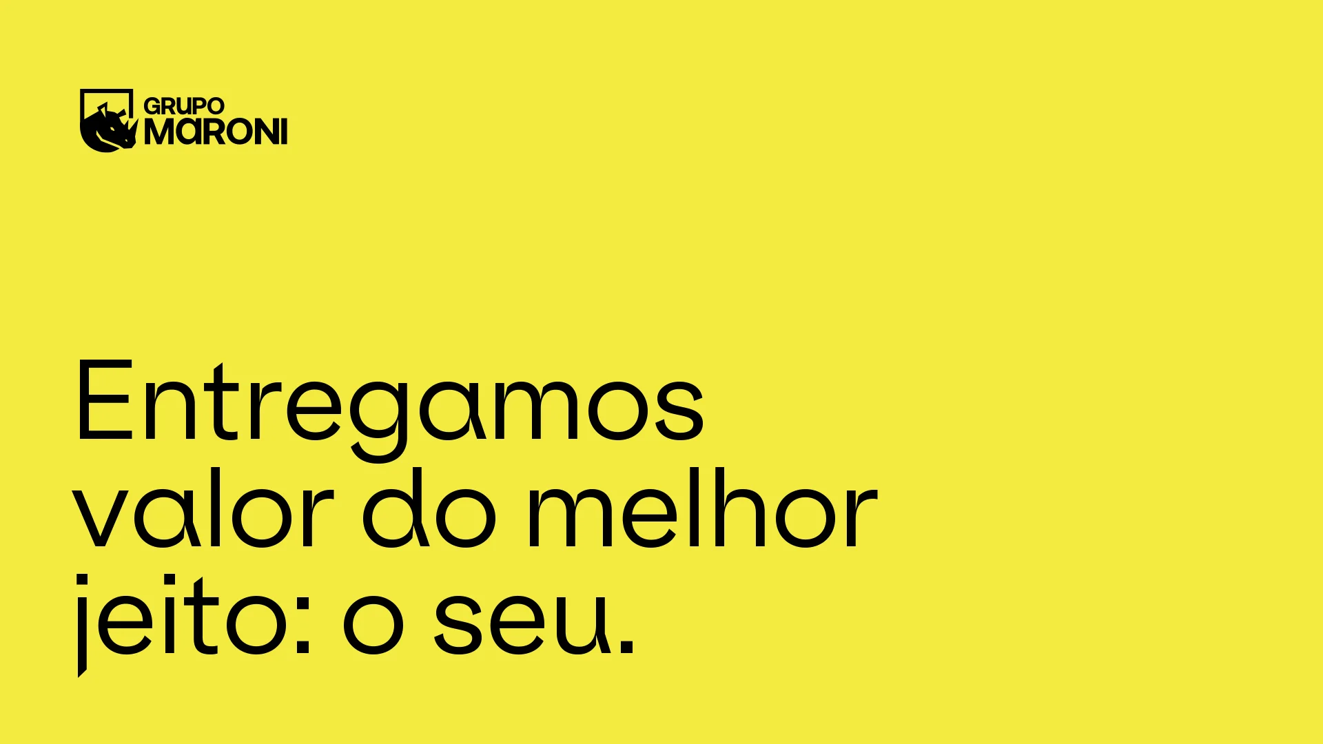
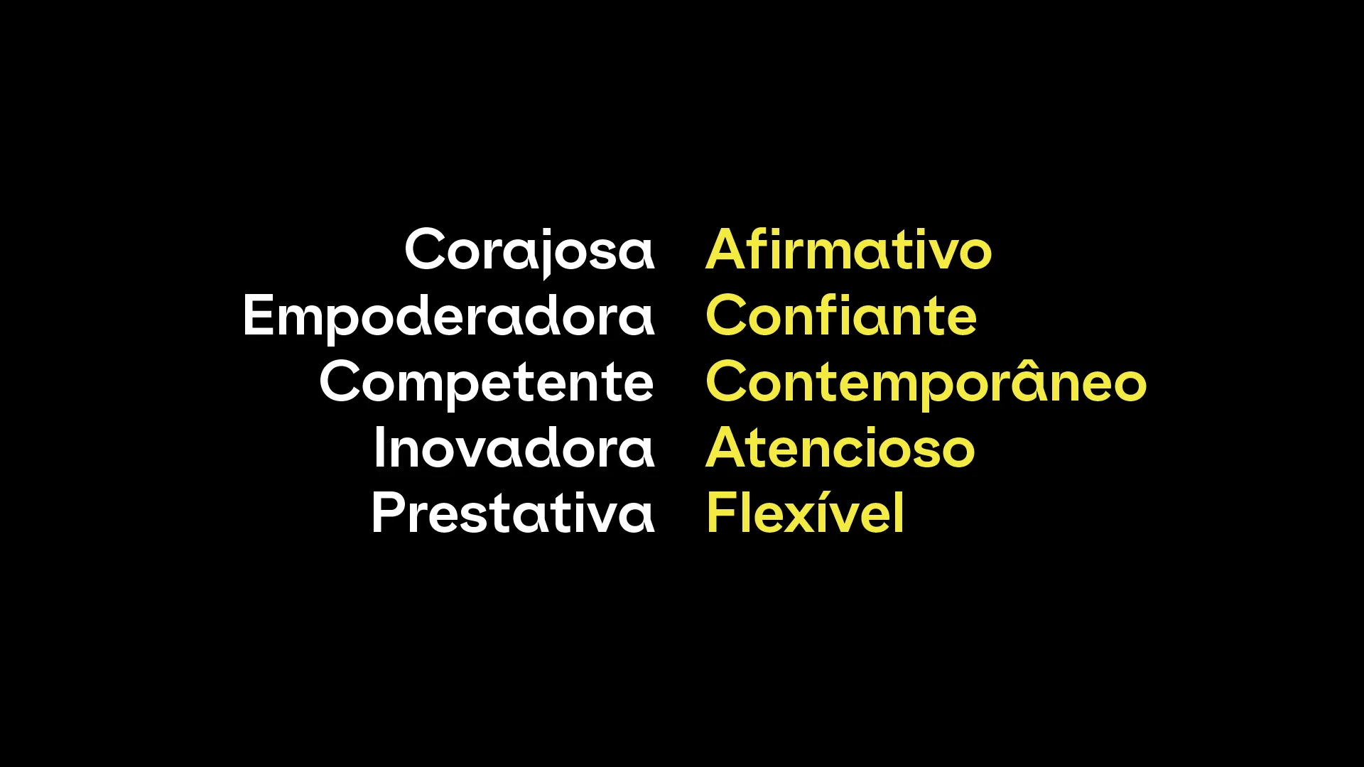
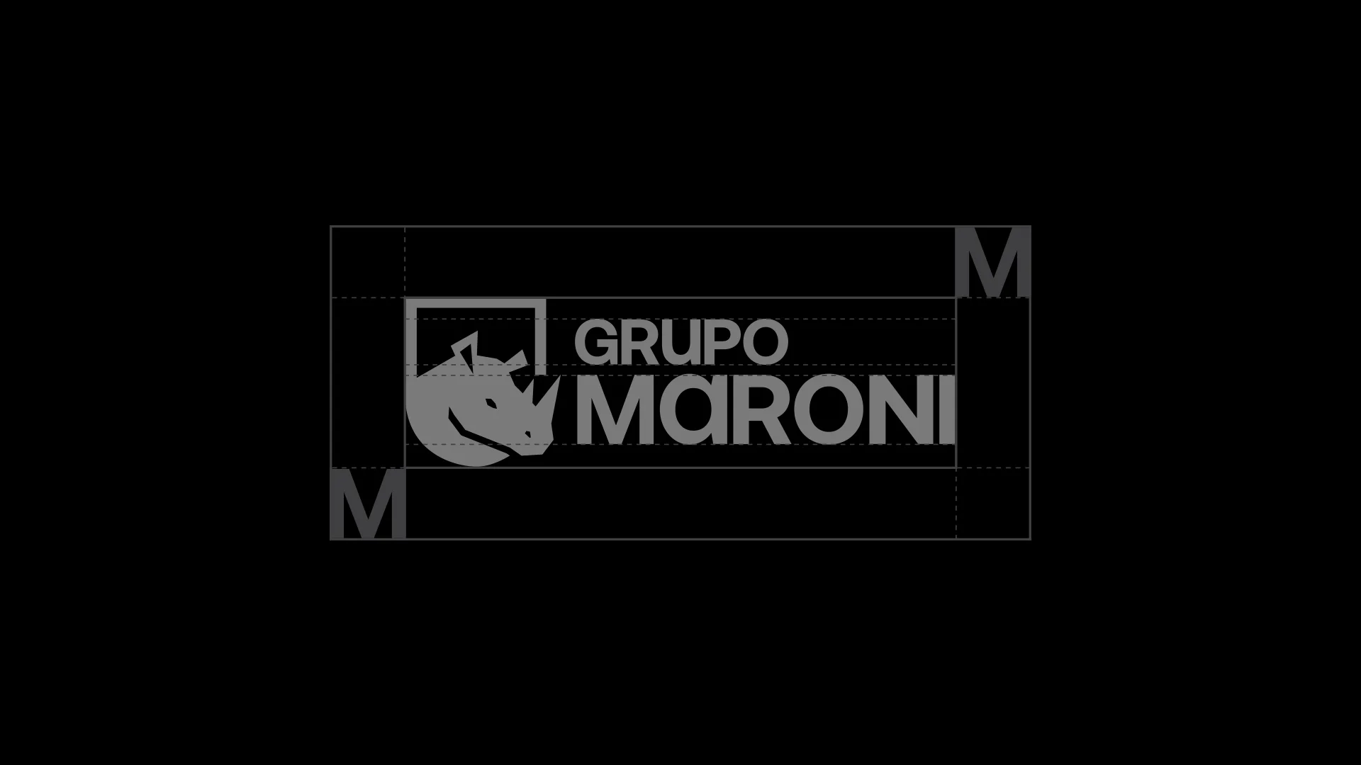
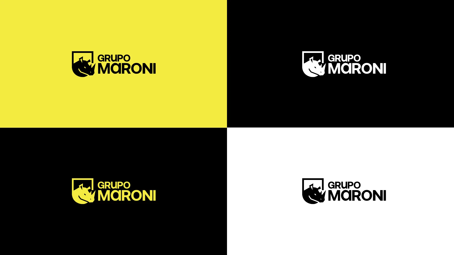
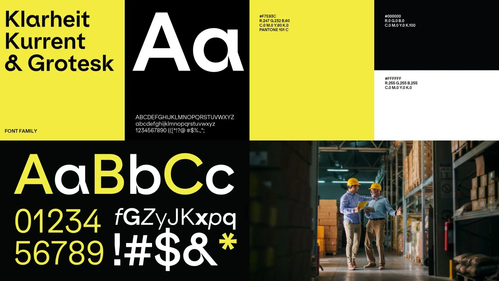
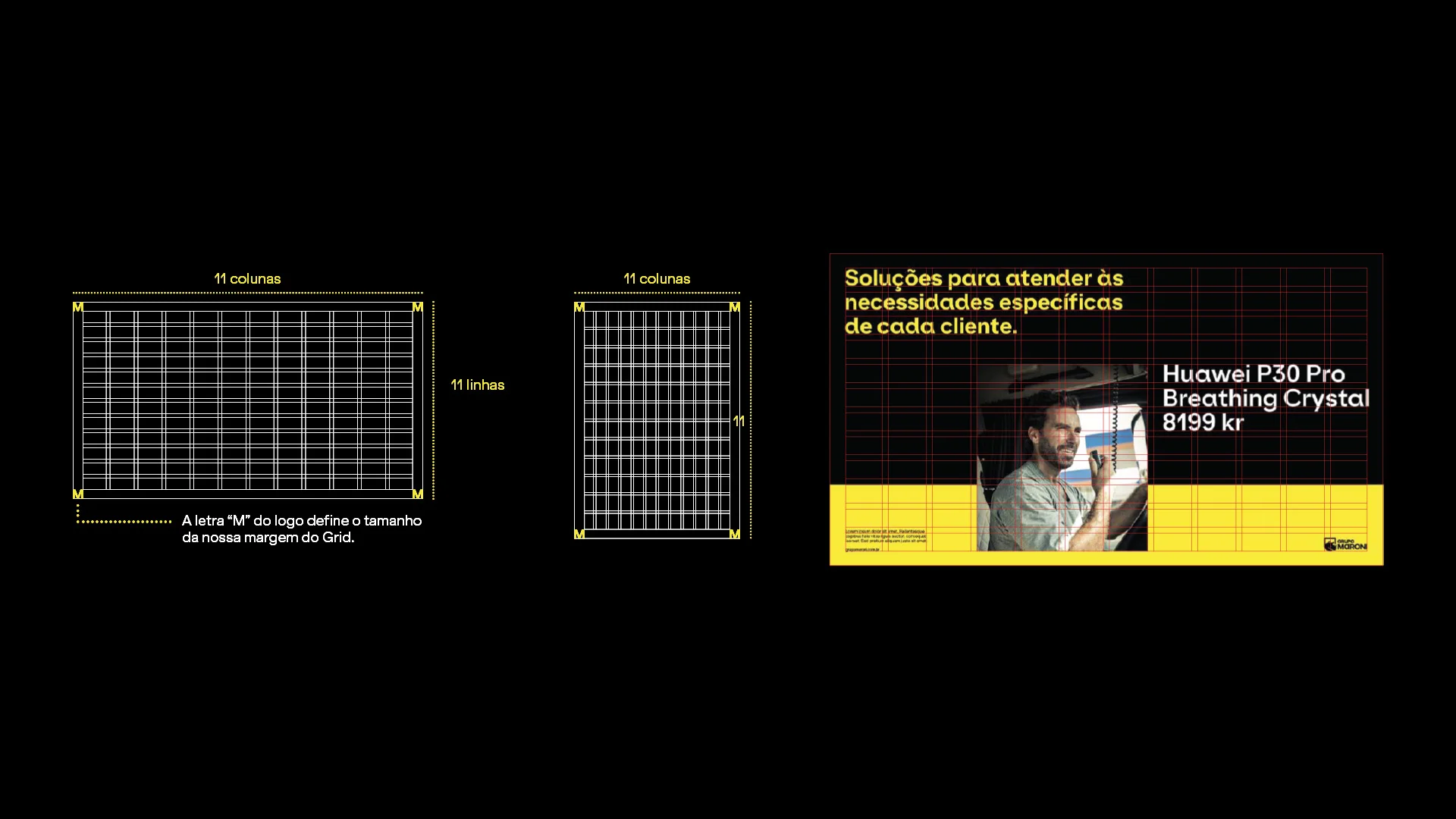
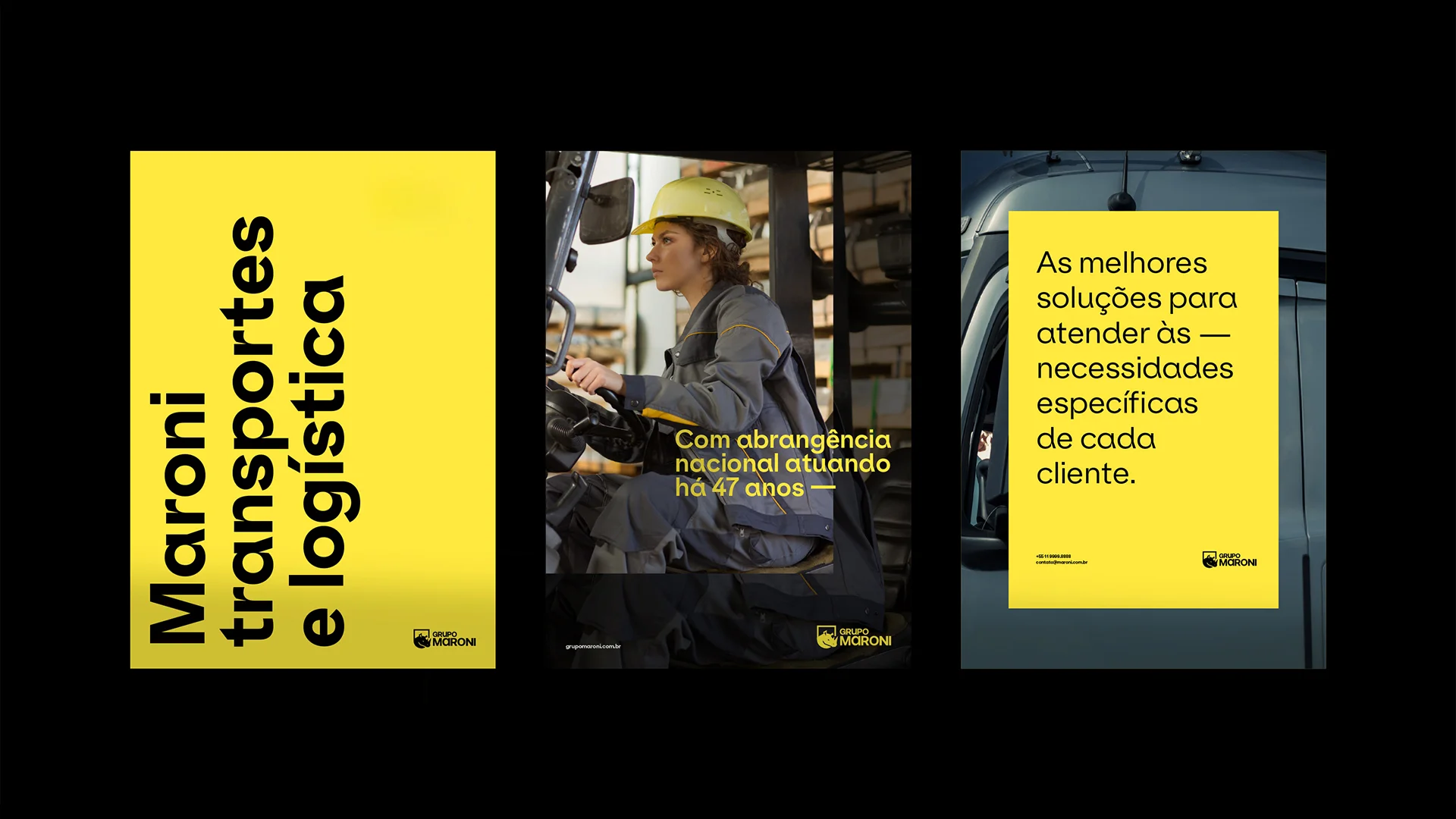
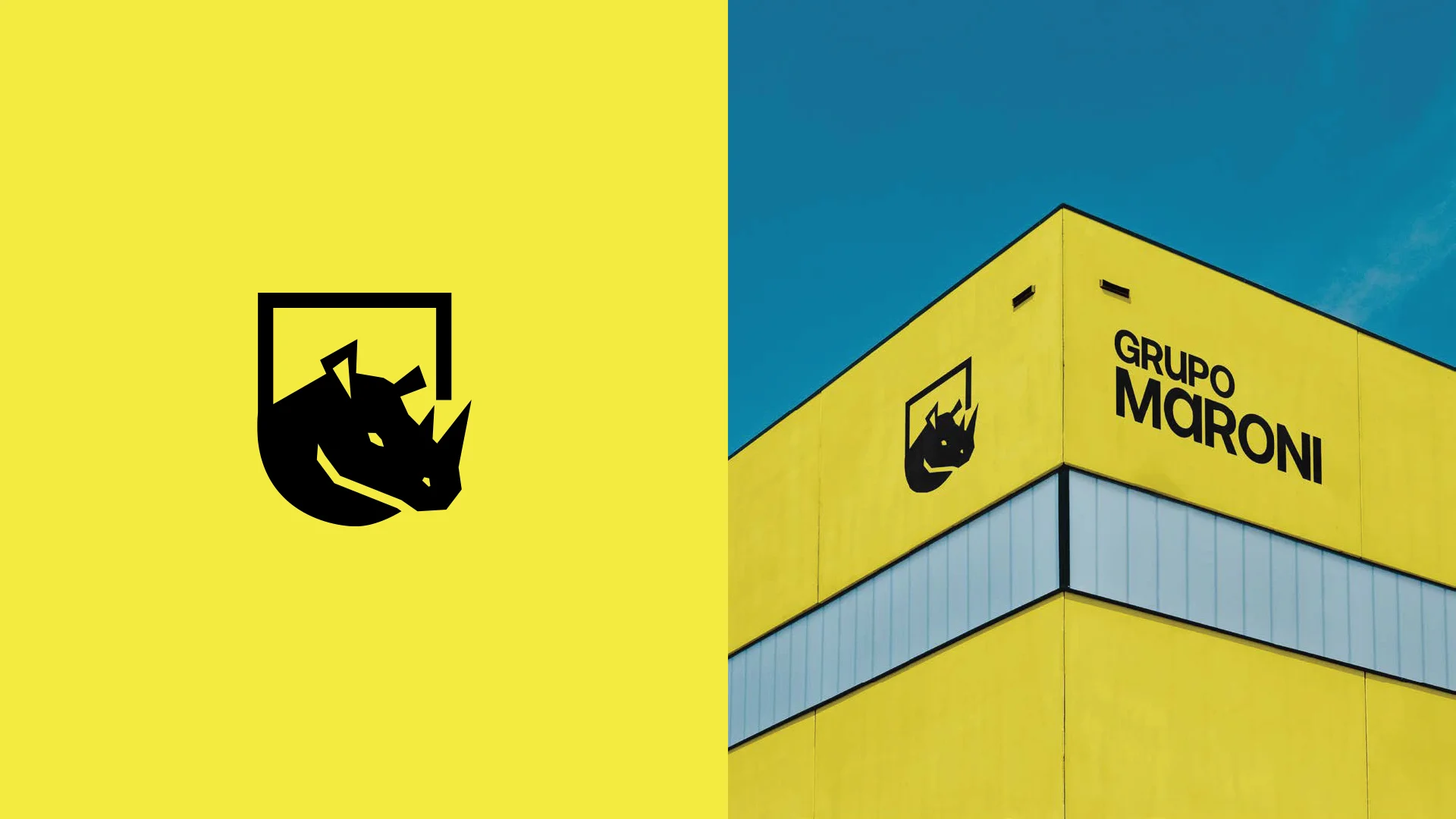
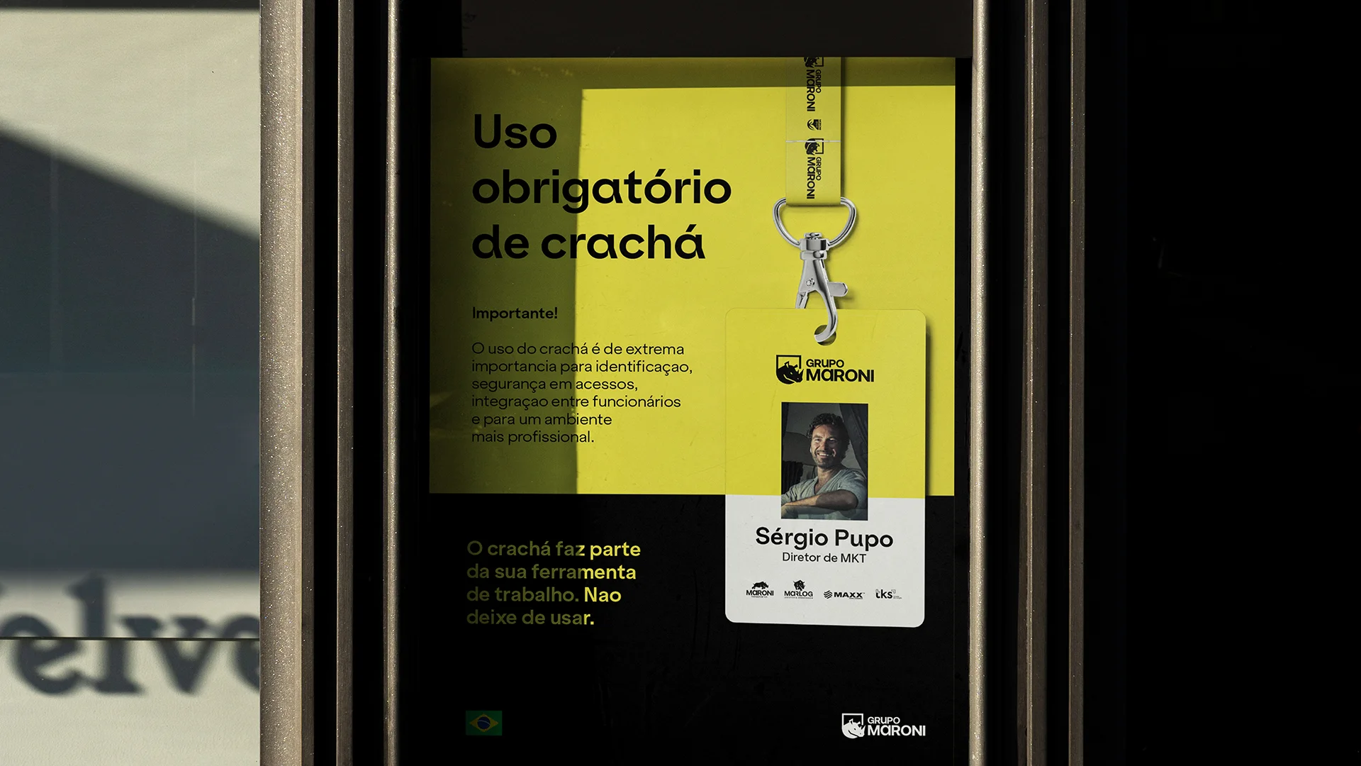
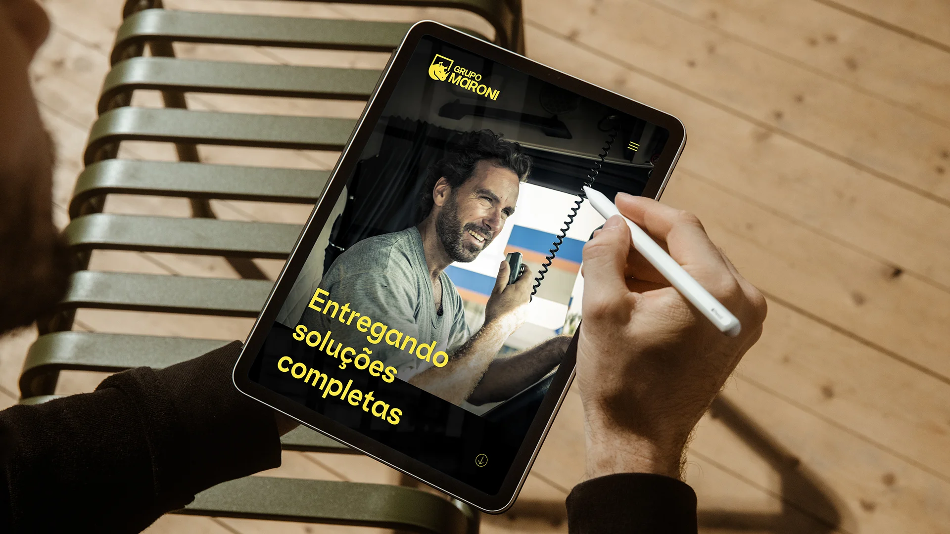
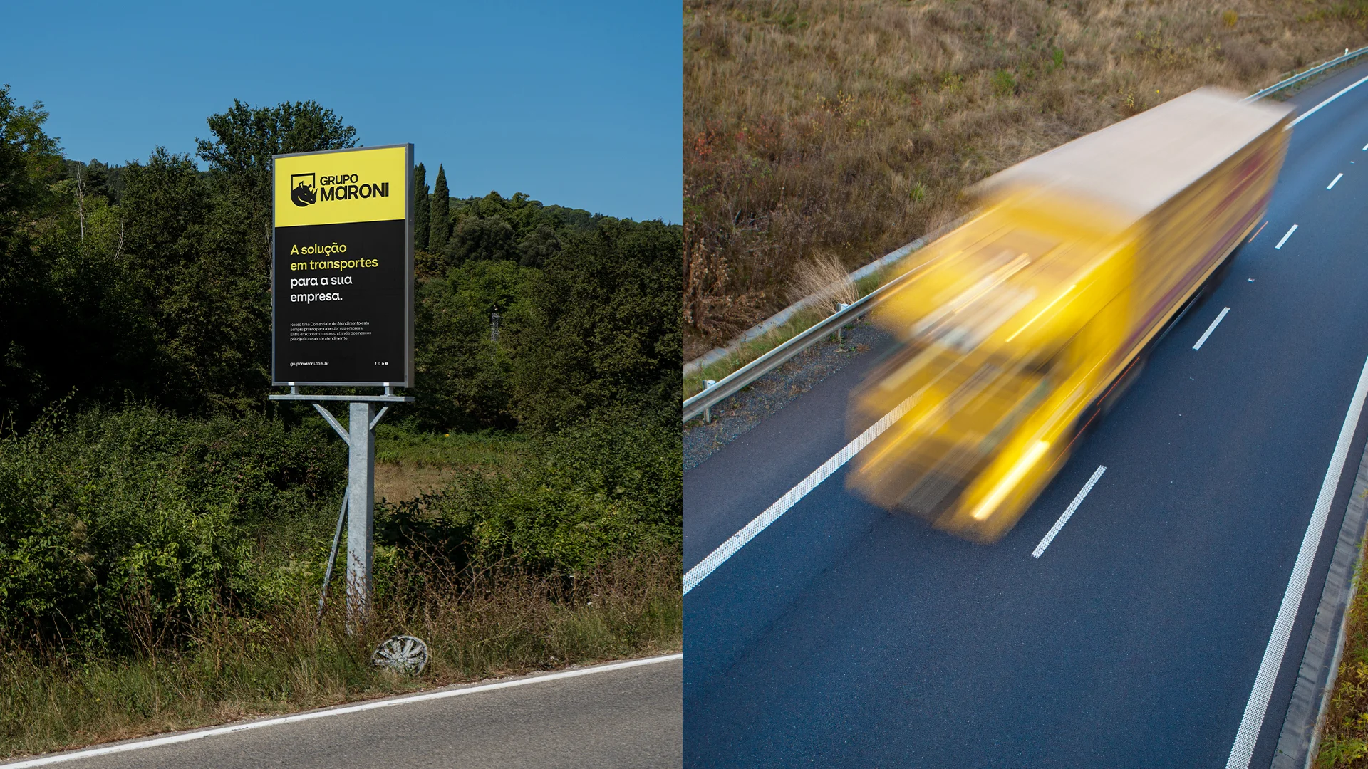
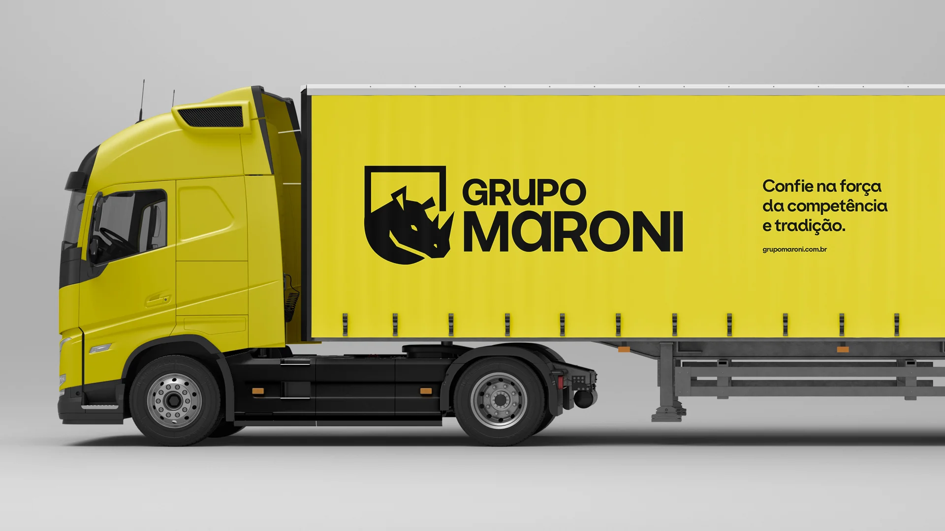
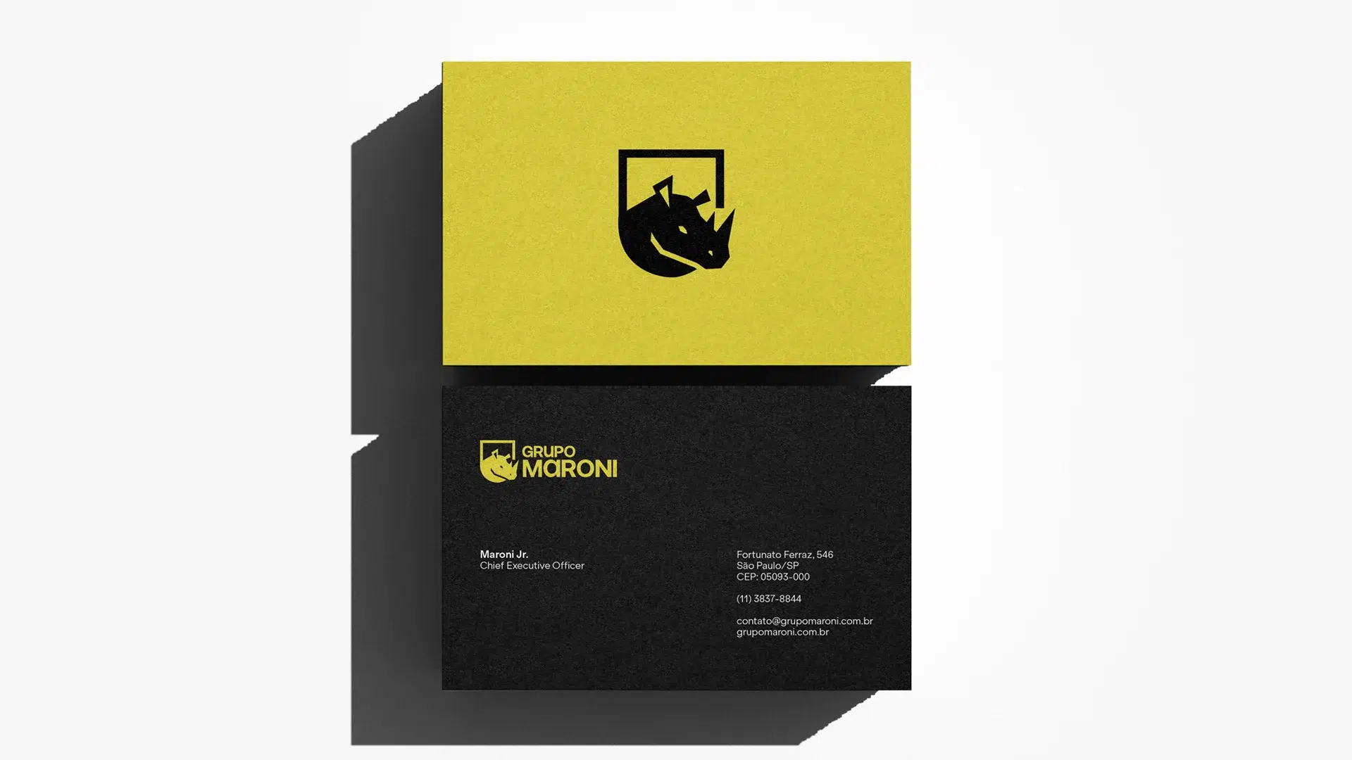
We structured the mixed-brand architecture and created the Maroni Group, which brought together all operations under a single strategic vision. We named and positioned the new companies TKS, focused on rentals and with a name inspired by the “thanks” symbol on truckers’ radio, and Maxx, dedicated to tires and with a name strongly rooted in the family’s origins in Xaxim, Santa Catarina. We defined unique and aligned brand platforms for each business. We created a proprietary verbal and visual universe, with symbols and elements that express robustness, simplicity, agility, and durability. The rhino was chosen as the group’s icon: a symbol of strength and courage. The identity combines solid typography, vibrant yellow, and a dynamic icon that adapts to different contexts, reflecting the versatility and constant evolution of the group’s companies.
The result
A strong and contemporary corporate brand that provides cohesion, personality, and strategic direction to all businesses, without losing the family spirit that has driven the group since 1973.